Case Study
PantryPlanner
An organizational app to help keep track of your groceries.
About the Project
PantryPlanner is an app to help users decrease their food waste by being an organizational tool. Users will have their virtual food inventory right in their pockets, making grocery shopping more efficient and accurate when creating shopping lists.
The Problem
In the sustainability and commerce industry, food waste is a huge, global issue, especially with 96% of household food waste ending up in landfills. Food waste occurs in common households due to poor meal planning, poor food literacy, and improperly storing food. To help these individuals lessen their contribution to this issue, PantryPlanner is an organizational tool to keep track of users’ food items so that they can prevent it from being wasted.
The Solution
The goal of this app is to assist people in keeping an organized fridge and pantry so that less food goes to waste. By having features in the app that remind users of expiration dates, giving tips on how to properly store food, keeping track of the groceries they have, and creating accurate and efficient grocery shopping lists, will help combat the growing global issue of food waste.
Design Process
1. Empathize
Secondary Research
Competitive Research
User Interviews
2. Define
Affinity Mapping
Empathy Maps
HMW Problem Statements
3. Ideate
Initial Ideas
User Stories
Information Architect
Red Routes
Branding
4. Prototype
Lo-fi Wireframes
Hi-fi Wireframes
Final Screens
Empathize
-
Food waste occurs at all levels of the food processing stage–from harvesting, to packaging, to delivery. However, the focus of this app will be taking a closer look between the everyday consumer and the food waste that occurs in various households.
Meal-planning Efforts
“. . . the ways that food products are packaged, placed and promoted in the traditional supermarket as reasons for food waste (Dobernig & Schanes, 2019).”
Food Literacy
“. . . Americans are prematurely throwing out food, largely because of confusion over what expiration dates actually mean (Sifferlin, 2013).”
Food Storage
“. . . leftovers were often ‘parked’ in the fridge and then forgotten (Dobernig & Schanes, 2019).”
-
As part of my research, I also looked on the current market to see what’s available to users. These apps and services as the ones I’ve found that provide some solutions to the problem of food waste, but also have flaws in their UX/UI:
USDA FoodKeeper
Summary:
This app helps users understand how long they can store their food and beverages. There’s an extensive list of foods ranging from baby food to condiments, with each being further specified.
Pros:
Accounts for a wide range of foods
Ability to add reminders to user’s calendar
Cons:
Not aesthetically pleasing
Too much text, not enough visuals
Outdated design
Grocery List: Out of Milk
Summary:
Out of Milk is a fully customizable, online shopping list made to be collaborative with users and their friends and family. This application also offers additional features such as pantry management tips and ideas, organized shopping tips, and essential household supplies list to name a few.
Pros:
Collaborative
Offers pantry management tips and ideas
Cons:
Users aren’t able to control which lists they want to see first
Categories create more steps than necessary
Bring! Grocery Shopping List
Summary:
This app helps users understand how long they can store their food and beverages. There’s an extensive list of foods ranging from baby food to condiments, with each being further specified.
Pros:
Produce suggestion for easier user flow
Recipe Guide
Cons:
Unable to create own categories
Cluttered UI design
-
To gather more information on the problem of food waste, I conducted my own user interviews after narrowing down my participants from a screener. My semi-structured interviews consisted of 5 participants from the United States, all with varying professions. Here are 3 most interesting quotes from those interviews:
Tyler:
“…I’m always second guessing whether I should throw something out or not.”
Sarah:
“…when the fridge is, like, really cluttered, my food typically goes towards the back and I forget that it’s there…Since I don’t see it for a long time…it’s not good to eat anymore.”
Montse:
“…the reheated version doesn’t taste as good as when it’s freshly made…it just doesn’t sound very appetizing. And unfortunately, it finds itself going to waste.”
Define
Affinity Maps
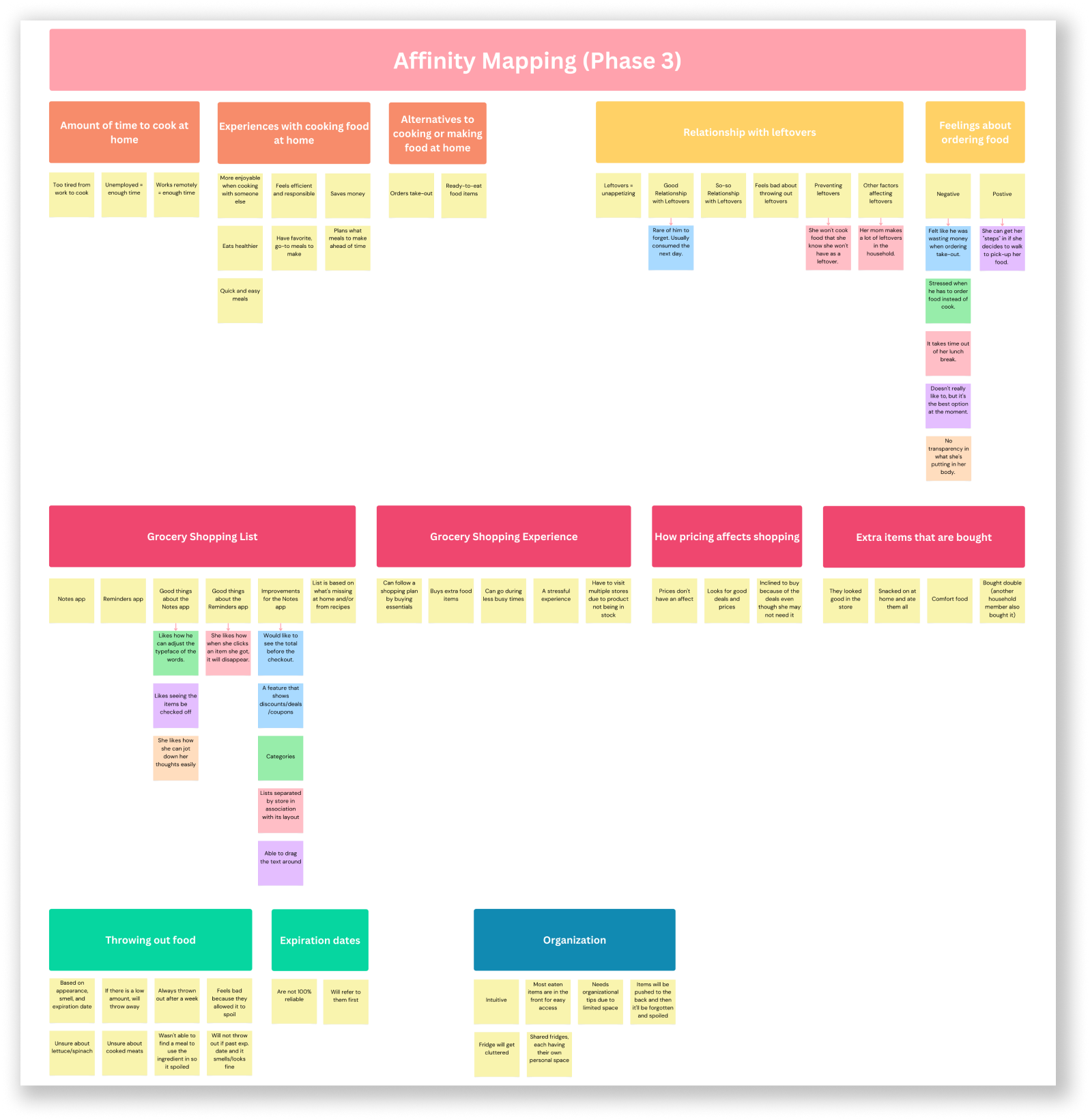
With my participants, I was able to create an affinity map that has a few categories with combined and individualized statements. Here are the four phases that shows my organizational process.
Phase 0
This phase consists of the highlights from each of my participants
Phase 1
With further organizing, I collected themes such as relationship with leftovers and throwing out food.
With more deduction, I combined statements that had common meanings such as being too tired to cook and grocery shopping being stressful.
Phase 2
The final phase has more to do with my design choice for organizing the sticky notes. This time around, I was able to properly come up with a design that shows the groups more clearly. In the end, I had fun putting my affinity mapping together. It helped me locate the pain points of my users that related to their relationship with food. It also allowed me to see from their point of view and move away from any biases I had.
Phase 3
Empathy Maps
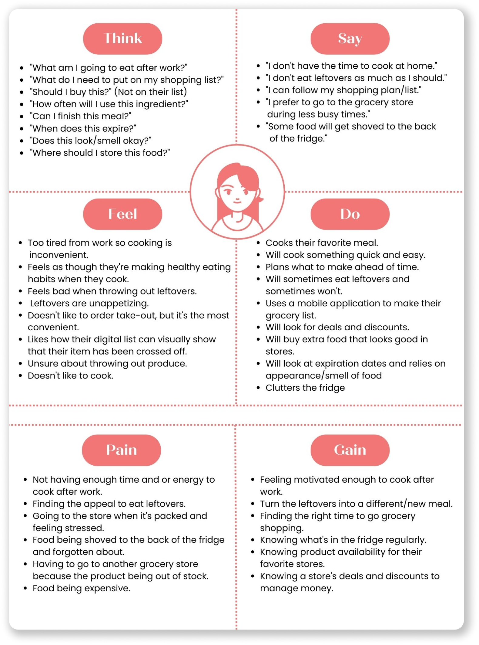
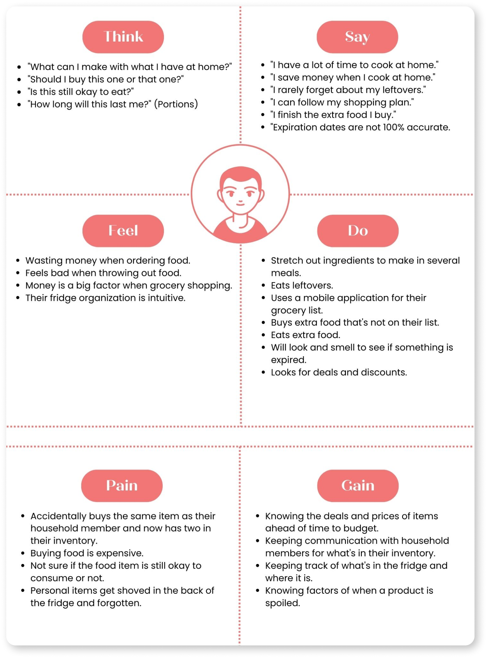
Next I was able to create 2 different empathy maps from my participants. What I found the most interesting is that one empathy maps represents a person who is resourceful when it comes to saving an ingredient for meals and the other empathy map represents a person who isn’t so innovative with their groceries so they would rather cook something quick and easy.
User Personas
With the empathy maps, I turned them into persona maps to help me visualize the types of users that would benefit the most from my app.
This persona represents those who don’t have the luxury of cooking at home, either because they’re too tired from work or not having enough time to cook after work. They find themselves ordering out more and having leftovers go to waste from outside sources.
Whereas this persona does have the time and energy to cook at home, but their food waste comes from the leftovers they don’t finish and not from buying too much at the store.
Top Insights
Overall, from both my seconday and primary research findings, I was able to deduce the main pain points consumers have when it comes to food waste. The first being that leftovers are unappealing to eat. Next, users are not sure whether or not to throw out food because of contradicting signs. Finally, fridge organization can either make the food item be consumed or be thrown to waste.
“How Might We…” Questions
So with all of these findings and observations, there comes the time where I need to think of “how might we” questions in order to brainstorm for some possible solutions to the pain points.
How might we prevent people from letting their food spoil and decrease the guilty feelings associated with it?
How might we create a smooth grocery shopping experience for people?
How might we recreate leftovers to be more appealing?
How might we teach people the shelf-life of food products?
How might we create an organized food system for people to refer back to and have a record of?
How might we create an engaging, individualized cooking experience for people?
Ideate
Initial Ideas
After thoroughly understanding my users and their paint points, the next step is to brainstorm some solutions. By going though my HMW questions, I drafted up a few possible solutions:
User Stories
With these initial ideas, I needed to really put myself in the shoes of my users. So, I came up with a few user stories illustrating their wants and needs from a service that would help with their food waste problem. With these user stories, I was able to prioritize them into my Minimum Viable Products (MVP) so that the essential features were highlighted and applicable for my users to complete critical tasks.
Information Architect
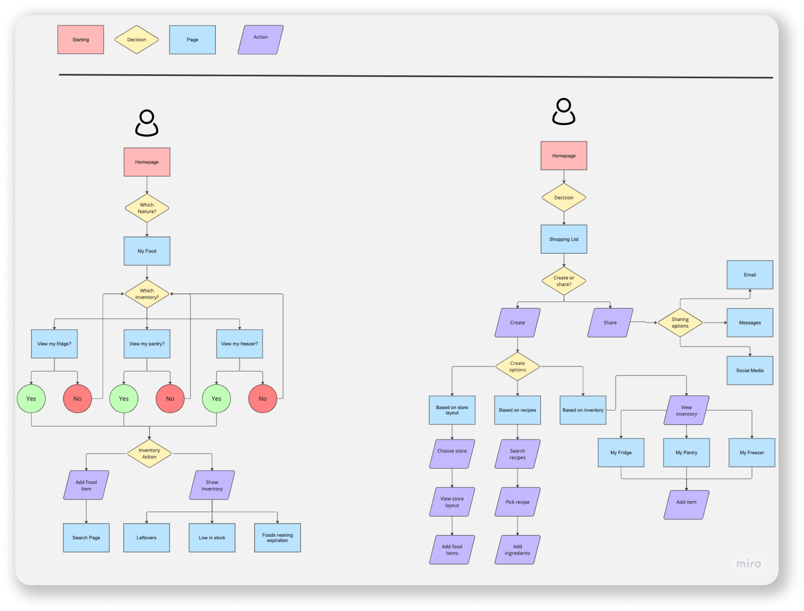
After coming up with my MVPs, I can work towards sketching my first red routes. To begin that process, I needed to figure out which pieces of information are the most important to my users and to determine the order in which these features and information are presented by honing in on my UI skills. Therefore, I created a sitemap and user flows.
User Flows
These user flows demonstrate that the app allows users to either view their food or ad to that section of their kitchen. It also shows users how they can create shopping lists either through recipes, personal inventory, or store inventory.
Red Routes
By identifying the essential information my users need and the order in which they should be represented, these are the sketches to my red routes:
These red routes consisted of the following user flows that would allow users to get the most out of the app:
Inputting food items either in the fridge or pantry
Scanning food item
Manually inputting
Searching from app’s database
Viewing personal inventory
As a list
As a visual
Creating a shopping list
Based on recipes
Based on personl inventory
Based on store inventory
Branding
With these red routes sketched, I started working on the branding of my app. Here is where I set up the foundation for how my users will think about and make connections about my work. Parts of my branding include my mission statement, personality, and attributes. This is my brand platform:
Rationale: I believe this brand name encompasses the purpose of the app. It’s straightforward and users will know that this helps with planning their groceries and food inventory. I also wanted something catchy so I used alliteration.
Company/Product Name:
PantryPlanner
Mission/Vision
Reducing food waste is a global issue. We supply tools to keep track and manage your personal food inventory to prevent food waste from happening in everyday households and to create sustainable relationships with food.
Rationale: The main goal of this app is to help all users who want to lessen their food waste and make a sustainable change in their life.
Brand Personality
PantryPlanner encourages sustainable planning for grocery items and food in order to not only help the planet earth, but individuals as well.
Rationale: I want users to see that if they can make a change with the amount of food they waste in their homes, it is powerful enough to help the world.
Rationale: This brand is reliable for users when they are trying to accomplish a task in real life. This app has accurate information displayed when they go out grocery shopping or when they’re trying to organize their pantry. This brand is also convenient and easy to pull up when they’re running errands and are on a time crunch. Being familiar to the user is also a major attribute in order to personally reflect and visualize their food inventory. Finally, PantryPlanner makes the mundane, stressful experience of grocery shopping and planning into a fun and interactive task.
Brand Attributes
Reliable, convenient, familiar, fun
Moodboard
Part of the branding process includes creating a moodboard. Here I combined several pictures that represent my goals on how I want the app to visually look. Here you can see the colors and simplicity I was going for:
Prototype
Lo-fi Wireframes
Before I could get started with my hi-fidelity screens, I need to draft up my lo-fidelity screens so that I can see my user flows come to life. Here these screens show the user flow to viewing items in your personal inventory with the option of viewing it as a list or as a visual representation.
Next, these screens are the user flow to creating a shopping list based on a recipe that is loaded from the app’s database.
Final Screens
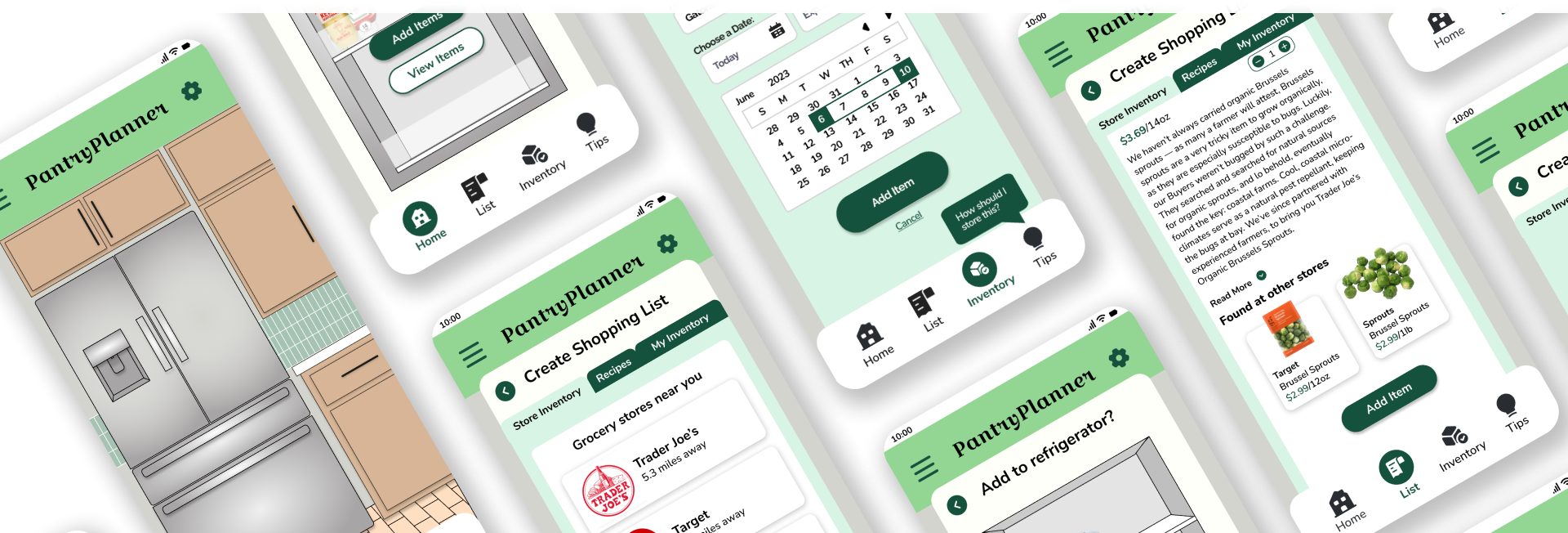
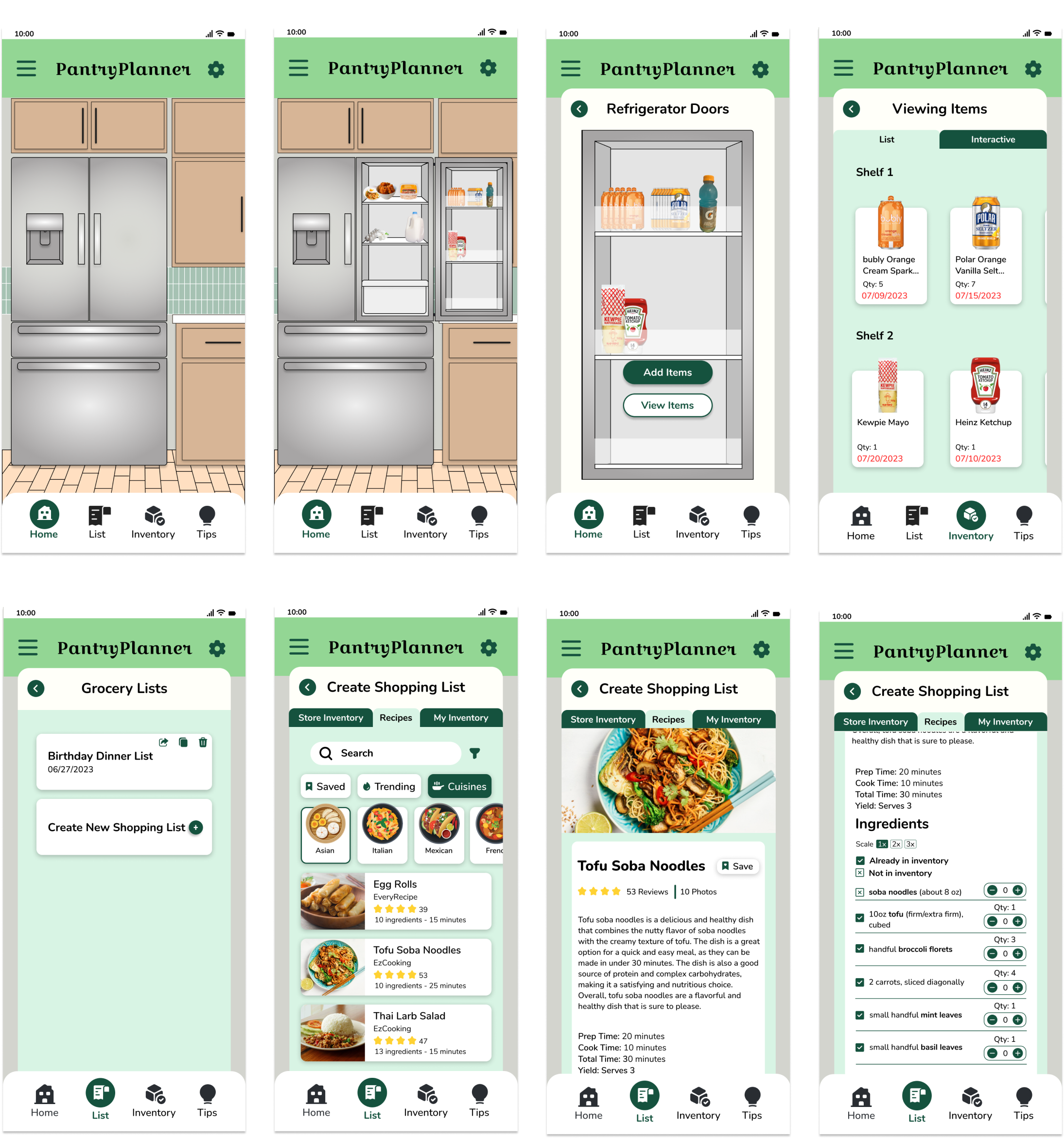
After testing these lo-fi screens, I gathered my results and was able to make the necessary adjustments in creating the smoothest experience for my users. These sets of screens show the user flow of viewing one’s personal inventory. I really focused on using images and visuals to help the users navigate through the app without having to be overwhelmed with the text.
Reflection
Challenges
This was my first UX/UI design project where I conducted all of the research, ideations, and designs. I bit off more than I can chew and finished the project later than I had anticipated. From now on, I need to stick to a stricter timeline so that I don’t feel as overwhelmed.
I found myself losing interest in this project, but after taking some breaks and recollecting my thoughts and interest, I was able to put my all in finishing the project.
I had so many ideas for this app that it was hard to narrow down the features until I conducted my user stories.
Lessons Learned
In order to back up your design choices, doing the proper research and gathering the right insights is crucial.
I learned that color combinations are very important to work with in order to make products and services accessible to everyone. Not all color palettes will work.
Gathering feedback after user testing is important as a designer since I would look over my work and miss things that users won’t.

